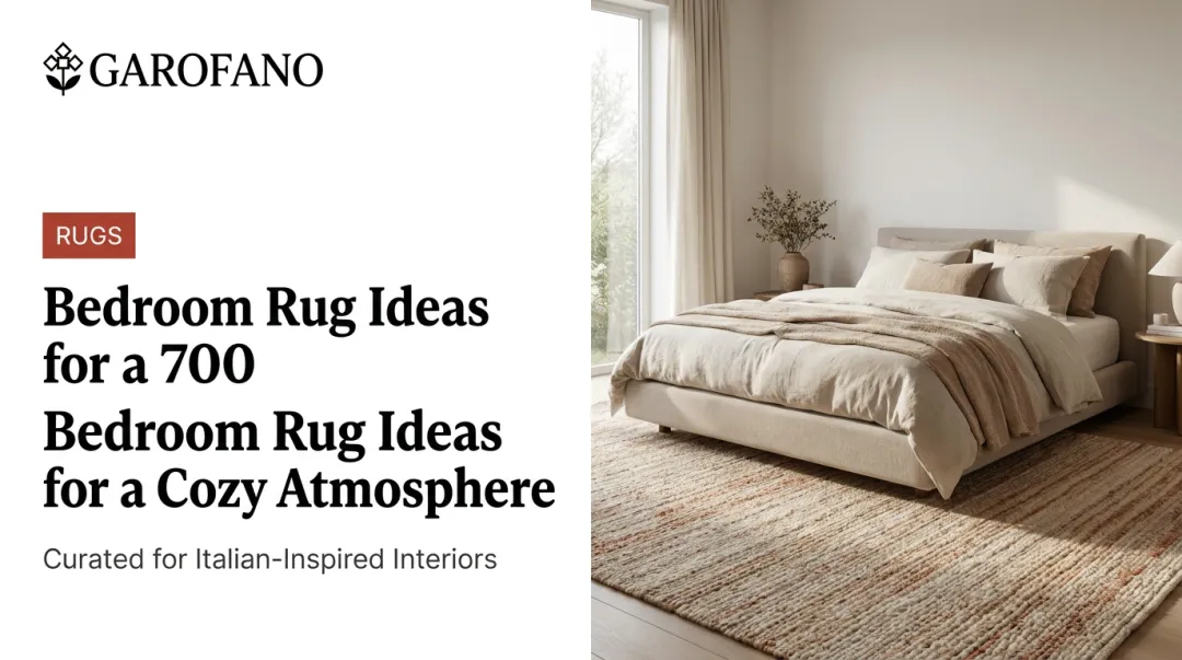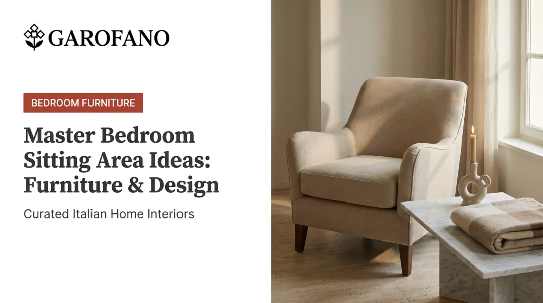
Warm off-white and ivory tones are showing up across bed frames, nightstands, and headboards, and for good reason. Cream reads softer and more expensive than stark white, without the coldness gray can bring to a bedroom.
Here's the catch, though. Many homeowners chase an "all-neutral" bedroom and end up with a space that feels flat, generic, or half-finished rather than curated. Swap in cream furniture without a plan for texture and undertone, and you can land in that same flat spot, just in a different color.
This guide covers why cream furniture works, the best pieces for building a neutral bedroom around it, and how to choose quality pieces that hold their look for years, not months.
Key Takeaways
- Cream furniture brings warmth and sophistication that's more forgiving than stark white
- Textures like bouclé, linen, wood, and metal matter more than the color itself
- Matching undertones across walls, floors, and furniture creates a curated, not mismatched, look
- Construction quality and finish determine whether cream furniture stays clean over years of use
Why Cream Furniture Is Leading Neutral Bedroom Design
Cream bedroom furniture covers bed frames, headboards, nightstands, and dressers finished in warm, off-white or ivory tones, rather than the cool white or gray that dominated neutral design over the past decade. The shift isn't purely aesthetic. It changes how a room feels day to day.
Cool neutrals can look clinical under normal room lighting. Cream carries a slight warmth that softens a space without adding visual clutter, which is why designers keep reaching for it in bedrooms meant to feel restful instead of sterile.
The data backs this up. Searches for "organic modern bedroom," a style Houzz defines by neutral surfaces and natural materials, rose nearly 3.5x year over year in early 2024.
Houzz's review of the fall 2023 High Point Market found warm neutrals, cream, caramel, chocolate, and terracotta dominating new furniture collections.
That's search interest, not proof cream outsells every other color. But it lines up with what's actually showing up in showrooms and mood boards: buyers want warmth back in their neutral rooms.
The breakdown below shows where cream works best, piece by piece, starting with the bed itself.
Top Cream Bedroom Furniture Ideas for Neutral Interiors
These picks are chosen for versatility: how easily each one styles into an existing room, and how well it anchors a neutral bedroom without a full renovation.
Cream Upholstered Bed as the Anchor Piece
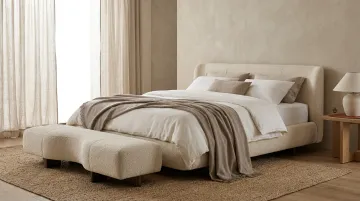
An upholstered cream bed does more visual work than any other single piece in the room. The soft, rounded lines of an upholstered frame instantly calm a space compared to a stark platform bed, and the pale tone keeps it from dominating the room the way a dark frame would.
Garofano's Letto Lucca is a good example of this done well: a made-to-order bed finished in soft cream upholstery, built with the tailored proportions of a boutique-hotel headboard rather than a mass-produced frame.
| Detail | Recommendation |
|---|---|
| Best Fabric | Bouclé, linen, or performance velvet for texture and durability |
| Styling Tip | Pair with dark wood nightstands for contrast against the soft cream tone |
Cream Bouclé or Velvet Headboard for Textural Contrast
Not ready to replace the whole frame? A standalone cream headboard adds the same softness without the commitment, making it a smart move for renters or anyone refreshing a room on a tighter budget.
Tufted or channel-stitched detailing keeps a cream headboard from reading flat. Without that dimension, a large panel of pale fabric can look more like a blank wall than a design feature.
| Detail | Recommendation |
|---|---|
| Best For | Renters or anyone updating a look without replacing the bed frame |
| Pairing | Brass wall sconces flanking the headboard for warm ambient light |
Cream Nightstands and Dressers for a Cohesive Suite
Matching cream nightstands and a dresser create the "furniture suite" look common in high-end hospitality interiors, where every piece feels chosen together rather than collected over time.
A bedside table like Garofano's Comodino Varese shows the idea in miniature: a single cream piece proportioned to sit alongside a matching bed or dresser instead of competing with it.
Hardware consistency matters here. Brushed brass or matte black pulls repeated across every piece read as intentional.
| Detail | Recommendation |
|---|---|
| Best Material | Solid wood with a painted or lacquered cream finish for longevity |
| Styling Tip | Vary drawer pull finishes slightly to avoid an overly matched, showroom feel |
Cream Wardrobes and Armoires for Seamless Storage
A large cream wardrobe visually recedes into a neutral wall in a way a dark armoire never will. That matters most in bedrooms without a built-in closet, where a big storage piece could otherwise dominate a small footprint.
Beyond blending into the wall, wardrobe doors offer their own opportunity for detail. Paneled or fluted styles add the kind of architectural detail you'd normally only get from custom millwork.
| Detail | Recommendation |
|---|---|
| Best For | Bedrooms without built-in closets needing large-capacity storage |
| Pairing | Matching cream ceiling trim or wall panelling for a built-in look |
Cream Accent Furniture for Layered Luxury
A cream bench at the end of the bed, a vanity stool, or an occasional chair in the corner adds the final layer that show homes always seem to have and everyday bedrooms often skip.
Pair the accent piece with one contrasting texture, rattan, leather, or slim metal legs, so the room doesn't slide into monotone. These pieces also work as connectors, bridging your cream furniture with bolder colors used elsewhere in the room.
| Detail | Recommendation |
|---|---|
| Best For | End-of-bed benches or reading corners |
| Styling Tip | Use as a connector piece between cream furniture and bolder accent colors |
How to Choose the Right Cream Furniture for Your Space
The biggest mistake homeowners make with cream furniture is picking the wrong undertone.
Match Your Undertone First
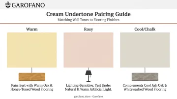
Cream isn't one color. It leans yellow, pink, or gray depending on the specific finish, and pairing the wrong one against your existing walls or flooring is what makes a "neutral" room look off rather than intentional.
- Yellow-based cream reads warm and pairs naturally with warm wood flooring
- Pink or red-based cream can look rosy under certain lighting, so check it against wood and upholstery samples first
- Grey-based cream reads cooler and closer to chalk, better suited to cooler wood tones
Architectural Digest's guide to neutral paint recommends checking that furniture, rugs, and flooring all complement a neutral's specific undertone before committing to a full room.
Prioritize Construction Over Labels
"Solid wood" isn't automatically superior to well-made veneer, especially on large case pieces like dressers and wardrobes. What actually matters:
- Check the joinery at drawer corners; dovetail joints outlast stapled ones by years
- Look at the finish coat, not just the wood species; a well-sealed cream surface resists soil and yellowing far better than an unsealed one
- Ask about the upholstery cleaning code (W, S, SW, or X) rather than assuming "performance fabric" means stain-proof
Round Out the Look
A few final touches keep a cream room from feeling flat or overwhelming:
- Get the scale right: Oversized cream furniture can swallow a small room just as easily as a dark piece, so measure clearances before ordering, especially for a wardrobe or a bed with a tall upholstered headboard.
- Layer at least two textures: A room built entirely from one shade of cream reads flat fast, so add velvet, linen, warm wood, or brushed metal around the furniture so the color has something to play against.
- Choose customizable, made-to-order pieces: Ready-made cream furniture is a gamble on undertone. Made-to-order pieces, like Garofano's customizable upholstery, let you match a specific cream tone to your walls and flooring instead of settling for whatever shade happens to be in stock.
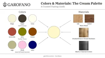
Colors and Materials That Pair Well with Cream Bedroom Furniture
Cream furniture sets the foundation for the room's overall design. What surrounds it decides whether the room feels calm, grounded, or personal.
Complementary color palettes:
- Soft neutrals: beige, taupe, and ivory for a calm, monochromatic feel
- Earthy tones: terracotta, olive, and warm brown for grounded warmth
- Jewel or pastel accents: sage, blush, or navy for personality without overwhelming the room
Complementary materials and finishes:
- Warm wood tones like oak and walnut for organic contrast
- Brushed brass or bronze hardware for warmth that echoes cream's undertone
- Black or charcoal accents for modern definition against the softness
Garofano's marble-led accent pieces, available in 55+ stone finishes, offer another way to introduce grounded contrast alongside cream furniture.
Warm brown is gaining ground fast as a cream partner. In 1stDibs' 2025 survey of 643 interior designers, 32% planned to use chocolate brown in their work, up from just 17% in 2023.
One rule matters more than any single color choice: match the undertone of your cream furniture to your wall paint and flooring, not just your bedding. A cream bed against a cool-gray wall and warm oak floor will always look slightly off, no matter how good the throw pillows are.
Conclusion
Cream bedroom furniture works when it's paired with texture, correct undertones, and solid construction, not color alone. A pale bed frame or dresser dropped into a mismatched room ends up looking exactly as flat as the all-white scheme it was meant to replace.
Plan your furniture suite together instead of buying piece by piece. A bed, nightstands, dresser, and wardrobe chosen as a set, even from different collections, is what gives a bedroom that curated, high-end feel instead of a showroom-assembled one.
If you're starting that plan now, Garofano's Italian-inspired, made-to-order pieces are built with the proportions and finish quality this kind of room needs. The cream-upholstered Letto Lucca bed is one example, and white-glove delivery is included on every order.
Frequently Asked Questions
What color goes with cream bedroom furniture?
Cream pairs well with soft neutrals like beige and taupe, earthy tones like terracotta and olive, or a single jewel or pastel accent such as navy or blush for personality.
Is cream color good for the bedroom?
Yes. Cream brings a soothing warmth that stark white lacks while staying lighter and more versatile than deeper neutrals, making it one of the easiest colors to build a restful bedroom around.
What color bedroom furniture is popular now?
Cream and other warm neutrals are trending alongside natural wood tones like walnut and oak, plus warm browns. These tones currently dominate new furniture collections across the market.
Does cream furniture make a small bedroom look bigger?
Cream won't physically enlarge a room, but its light-reflecting, low-contrast quality keeps a small bedroom from feeling boxed in the way dark furniture can.
How do you keep a cream bedroom from feeling flat or boring?
Layer in at least two or three textures: bouclé, linen, wood, or metal. Add one accent color or material so the room has visual depth beyond the color itself.
Is cream furniture hard to keep clean?
Not with the right specification. Sealed wood finishes and performance fabrics with a documented cleaning code resist staining far better than unsealed or untreated surfaces.